It is the quality and competency of printing materials that
deserve the sheer attention of onlookers. Such quality and
competency are in LG Hausys ad and graphics materials, which
have been chosen to facelift the brand images of thousands of
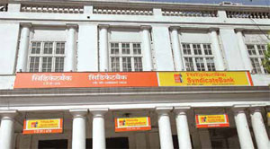
Syndicate Bank branches and ATM booths across the country. SIGN & GRAPHICS captures the landmark
image building project being carried out extensively in southern and northern regions of the country.
Its quite a fact that LG Hausys ad
and graphics materials are designed
to empower image and outlook of
a brand or a product. In this, Syndicate
Bank has opted LG Hausys cast vinyl and
flex materials for the countrywide project
to facelift its 3600 branches and ATM
booths located in major cities and towns
around southern and northern parts of the
country. The project was started in January
2015 and is now almost finished with some
new branches of the bank coming up in the
southern region.
In the project, a collective total of 3000
Syndicate Bank branches, including
ATM booths, have so far been completed
in the southern region and 600 in the
northern part. In the south, the project has
been carried out across Karnataka and
Chennai. Similarly, in the northern part,
the project has been accomplished in Delhi,
Chandigarh, Punjab and Rajasthan. LG
Hausys Cast LA9000 Vinyl Series, Lucky
Flex and LD3880 Wall Graphics Film with
five years warranty are the materials used
in the image-building project.
Vibrant colour textures
When Syndicate Bank instigated
incarnation of its branches and ATM
booths into a brand new outlook with
the change of logo, graphic designs and
colour schemes, LG Hausys materials
created the standout appearance. In the
new logo of the bank, the pictorial dog
is in sync with the motto Faithful and
Friendly. The combination of orange,
yellow and white brings the uniqueness to
the logo.
In fact, the orange colour in the new logo
of Syndicate Bank uniquely represents
power, energy, enthusiasm and creativity,
thoughtfulness and sincerity. On the other
hand, it (orange) indicates the banks
vibrancy, competency and confidence
to reach the next horizon of business.
Meanwhile, the
yellow indicates
innovation,
backing the
vibrancy and
quick decisions
through
collective work
and thinking.
A new avatar
As the project
progressed,
Syndicate Bank
followed uniform
layouts and
colour patterns throughout the branches
and ATM booths in either of the regions,
whether it would be in south or north. In
this, LG Hausys ad and graphics materials
are suitable choices and such premium
quality materials stipulate the banks
corporate identity to have a good image
and impression. In the image-building
project, new glow sign boards are now
being placed with vinyl and sticker on flex,
instead of printing merely on flex, just to
increase vibrancy of the display graphics
and to avoid colour fading.
Syndicate Bank, with its wide network of
branches and dedicated human capital, has
an ambitious goal of achieving higher level
of business with contribution from each
and every Syndian with utmost honesty,
perfection and commitment. The companys
endeavour shall be to make this possible
by way the companys dedicated team
work supported by the new brand identity.
Wherever the branches are functioning in
upper floors, Syndicate Bank has taken
steps to explore moving such branches to
ground floor at the time of renewal of lease,
to give a better visibility.